

Table of Contents
- Why Paper Choice Makes or Breaks Your Wall Art
- Photo Paper vs Fine Art Paper: What's the Difference?
- Matte vs Lustre Photo Paper for Wall Art: Which Finish Wins?
- GSM Paper Meaning for Art: Finding the Right Weight
- How to Print Digital Art at Home: A Step-by-Step Guide
- Archival Quality and Print Longevity: What to Look For
- Budget vs Professional Paper: Testing and Choosing
- Frame-Ready Prints and Final Checks
- Frequently Asked Questions
Last Updated: September 7, 2026
Choosing the best paper for printing wall art is the single biggest factor between a print that looks gallery-ready and one that looks like a home office mistake. The right paper for printing wall art affects colour accuracy, texture, and how long your piece survives before fading. At Thistle and Ink Art, we create digital downloads designed to be printed at home or professionally. Below, we break down the paper types, weights, and finishes that matter, and give you a clear decision framework for your specific printer and art style.
The common assumption is that any glossy photo paper will do. That assumption is wrong, and it is why so many digital art prints end up looking washed out or reflecting glare from every window in the room.
Why Paper Choice Makes or Breaks Your Wall Art
Paper choice determines three things: how faithfully colours reproduce, how the surface interacts with light, and how long the print lasts. A vibrant digital portrait printed on the wrong paper can look dull, while a subtle illustration can be ruined by excessive gloss.
Most home printers handle everyday documents well, but art reproduction demands more. The coating on the paper controls ink absorption, which directly affects colour gamut and detail sharpness. A paper with a poor inkjet coating will let pigment-based ink bleed, softening fine lines and reducing the crispness of your artwork.
For renters and homeowners alike, the stakes are visual. Wall art is meant to be seen from a distance, but also examined up close. A print that fails on texture or finish consistency will be obvious the moment it is framed and hung.
Photo Paper vs Fine Art Paper: What's the Difference?
Photo paper is a resin-coated or plastic-based paper designed for photographic images, while fine art paper is typically 100% cotton-rag or cellulose-based with a natural, textured surface.
Photo papers have a smooth, often glossy or lustre finish that delivers a wide colour gamut and high dmax, making them ideal for photography and vibrant digital art. They are usually cheaper per sheet and widely available. However, many contain optical brightening agents (OBAs), which can yellow over time.
Fine art papers, by contrast, are prized for archival quality. They are often acid-free, OBA-free, and made from cotton-rag or mould-made cellulose. The surface texture, from smooth hot-press to textured cold-press, adds a painterly quality that suits illustrations and reproductions of traditional media.
| Paper Type | Best For | Surface | Archival Quality | Typical Use |
|---|---|---|---|---|
| Photo Paper (Glossy) | Vibrant photos, bold digital art | High gloss, reflective | Lower (OBA content) | Snapshots, posters |
| Photo Paper (Lustre/Satin) | Portraits, gallery prints | Semi-gloss, subtle texture | Moderate | Framed wall art |
| Fine Art Paper (Matte) | Illustrations, watercolour-style art | Textured, non-reflective | High (acid-free, cotton-rag) | Gallery and museum prints |
The distinction matters most for longevity. If you want a print to look the same in ten years as it does today, fine art paper with archival standards is the safer bet. For a temporary rental refresh or a gift on a budget, quality photo paper still performs well.
Matte vs Lustre Photo Paper for Wall Art: Which Finish Wins?
For most wall art, lustre paper wins over matte because it offers a subtle texture that hides fingerprints, resists glare better than glossy, and still delivers rich colour saturation. Matte paper, while glare-free, can make vibrant colours appear flatter and less dimensional.
Lustre, sometimes called satin, sits between glossy and matte. It has a light texture that catches light softly, which suits framed prints under glass where reflection is a concern. It is the default choice for professional portrait photographers for good reason.
Matte paper has its place. It is excellent for fine art reproductions, especially pieces with lots of textural detail or a painterly feel. Matte also photographs well, avoiding the hotspots that glossy finishes create under direct light.
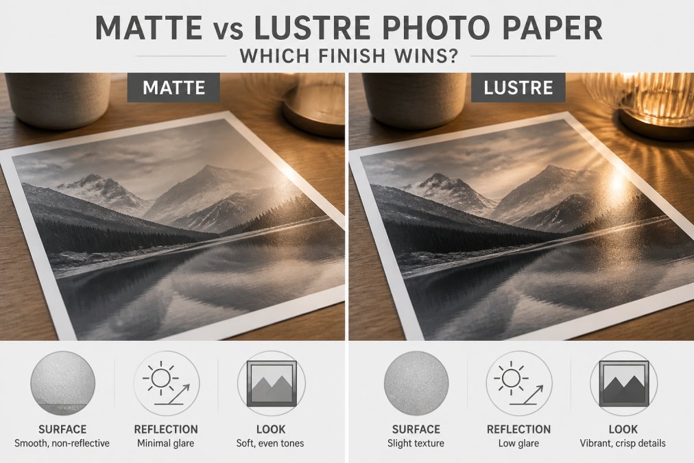
The deciding factor is the artwork itself. Bold, colourful digital portraits with high contrast pop on lustre. Soft watercolour-style pieces look more authentic on matte. Consider where the print will hang: a bright, sunlit room favours matte or lustre over glossy to avoid glare.
GSM Paper Meaning for Art: Finding the Right Weight
GSM stands for grams per square metre, and it measures paper weight and thickness (iso.org). For wall art, a GSM of 200 to 300 is the sweet spot for photo papers, while fine art papers typically range from 190 to 310 GSM.
Lower GSM papers, around 120 to 150, are flimsy. They curl, show ink bleed, and feel cheap when framed. Papers below 180 GSM are best reserved for proofing, not final wall art.
The GSM paper meaning for art goes beyond weight. Heavier papers resist curling and hold their shape in a frame without buckling. A 250 GSM lustre paper feels substantial and professional. Fine art papers at 300+ GSM approach the thickness of light cardstock, offering a premium, substantial presence on the wall.
Paper weight also affects how the print handles. Thicker papers can be harder to feed through some home printers, especially those with sharp bend radii. Check your printer's specifications for maximum paper weight before buying a heavy fine art paper.
How to Print Digital Art at Home: A Step-by-Step Guide
Printing digital art at home requires matching your file resolution, colour profile, and paper to your printer's capabilities. A common mistake is printing a file designed for screen directly, which often results in colours that look different on paper.
Start with the right file. High-resolution JPGs or PNGs at 300 DPI are essential for crisp prints. The digital downloads from Thistle and Ink Art are supplied as high-resolution files specifically so they print cleanly at home or professionally.
- Step 1: Set your printer to the correct paper type (e.g., "Photo Paper Glossy" or "Fine Art Matte") in the print dialogue.
- Step 2: Disable colour management in your application and let the printer driver handle colour, or install the correct ICC profile for your paper and printer combination.
- Step 3: Print a small test section first to check colour accuracy and sharpness before committing to a full sheet.
- Step 4: Allow the print to dry completely, usually 10 to 30 minutes, before handling or framing.
- Step 5: Handle prints by the edges; skin oils can leave marks that are difficult to remove.
Pigment-based ink is preferred over dye-based ink for longevity. Pigment inks are more resistant to fading and water damage, which matters for prints that will hang in bright rooms for years.
Archival Quality and Print Longevity: What to Look For
Archival quality refers to how long a print retains its original appearance without significant fading or yellowing. The two main factors are the paper and the ink, and both must be archival for the print to last.
Look for paper labelled acid-free and lignin-free. Acid causes paper to yellow and become brittle over time. Cotton-rag paper, made from cotton fibres rather than wood pulp, is naturally acid-free and highly durable. Many fine art papers are also OBA-free, meaning they contain no optical brightening agents that can degrade and cause yellowing (loc.gov).
The Image Permanence Institute's research on print longevity provides detailed guidance on how different ink and paper combinations perform over time. Their findings consistently show that pigment-based inks on archival fine art paper offer the longest display life.
For a piece intended as a permanent fixture or a meaningful gift, investing in archival paper and pigment ink is worthwhile. For a seasonal refresh or a piece you may swap out, standard photo paper is acceptable.
Budget vs Professional Paper: Testing and Choosing
Budget-friendly paper is fine for testing compositions, colour balance, and layout before committing to expensive sheets. Professional-grade paper is for the final piece. The cost difference is significant, so a testing workflow saves money and waste.
A practical approach is to buy a sample pack of different papers. Print the same image on each and compare them side by side under the lighting conditions where the art will hang. Pay attention to colour accuracy, surface texture, and how the paper feels in a frame.
- Budget testing: Standard 200 GSM matte or glossy photo paper from a high-street retailer.
- Mid-range: 250 GSM lustre photo paper, widely available and suitable for most home prints.
- Professional: 300+ GSM cotton-rag fine art paper for archival, gallery-quality results.
The environmental impact of paper choices is worth considering. Many fine art papers are made from sustainably sourced cotton or certified wood pulp. Look for papers with environmental certifications if sustainability matters to you.
Frame-Ready Prints and Final Checks
Before framing, check your print for quality issues. Examine it under bright light for banding, ink bleed, or colour shifts. Hold it at an angle to check for surface defects or uneven coating.
Consider the frame and mounting. Prints on 200+ GSM paper can be mounted directly in a frame with a backing board. Heavier fine art papers may require professional mounting or a deeper frame to accommodate their thickness. For unframed displays, such as clip frames, ensure the paper is thick enough to remain flat without curling.
Wall art from Thistle and Ink Art, such as the Personalised Photo to Digital Art Portrait (£8.99) or the Glasgow Skyline - Digital Download (£6.99), is designed to be printed and framed easily. These high-resolution downloads give you the flexibility to choose the paper that best suits your space and budget.
The final check is simple: does the print look like it belongs on your wall? If the colours are true, the texture suits the artwork, and the paper feels substantial in hand, you have made the right choice. The best paper for printing wall art is the one that makes your piece look intentional, polished, and ready to be enjoyed for years.
Choosing the right paper for printing wall art comes down to matching the surface finish and weight to your artwork and its environment, while balancing budget against longevity. Lustre photo paper is the versatile default for vibrant digital art, while archival fine art paper rewards those seeking permanence. Thistle and Ink Art supports this process with affordable, instant digital downloads that put the paper decision in your hands. Get started with Thistle and Ink Art and bring a personalised portrait or Scottish skyline to life on paper that does it justice.
Frequently Asked Questions
Should I print wall art glossy or matte?
For most framed wall art, matte or lustre finishes are the safer choice. Glossy paper reflects light, which can create glare under home lighting and distract from the image. Matte paper offers a non-reflective, modern look that suits illustrations and abstract art, while lustre provides a subtle sheen with a texture that hides fingerprints. If your art has high contrast or deep blacks, a lustre finish can add depth without the glare.
What is the best paper for printing artwork at home?
For home inkjet printing, a heavyweight matte or lustre paper between 200 and 300 GSM is ideal. This weight feels substantial and lies flat in a frame. Look for papers specifically designed for inkjet printers with an instant-dry coating.
What GSM paper is best for art prints?
For wall art, aim for 200 GSM or higher. Papers below 200 GSM are too thin and may curl or show creases. A 250-300 GSM paper is the sweet spot, offering a professional, gallery-quality feel. This weight range is thick enough to hold its shape in a standard frame but still flexible enough to work with most home printers. Always check your printer's maximum paper weight specification before buying.
Can I use regular printer paper for digital art prints?
You can, but the result will look washed out and feel flimsy. Standard 80 GSM office paper is too thin and not coated to hold ink, so colours bleed and the print lacks the vibrant finish of proper art paper. For a piece you plan to frame, investing in a dedicated inkjet paper of at least 200 GSM makes a noticeable difference. It is the most impactful step for a professional-looking result.