

Table of Contents
- Choosing the Right Wall for Your Gallery Wall Layout
- Gallery Wall Template Ideas: Planning Before You Hang
- Selecting Art, Frames, and a Cohesive Colour Palette
- Gallery Wall Spacing Tips for a Polished Arrangement
- Best Tools for Hanging Gallery Walls Without the Guesswork
- Step-by-Step Gallery Wall Layout Hanging Guide
- Common Gallery Wall Mistakes to Avoid
- Conclusion
Last Updated: August 21, 2026
Choosing the Right Wall for Your Gallery Wall Layout
A gallery wall layout works best when you choose the wall before you choose the art. Start by identifying your focal point, walls you look at naturally, such as the one opposite your sofa, at the top of a staircase, or behind a bed headboard.
Measure the wall space carefully. For a standard living room wall, the overall arrangement should occupy roughly two-thirds of the available width, leaving breathing room on either side. Consider the wall's relationship to furniture: a gallery wall should feel anchored above a sofa, not airborne. Finally, check your wall construction. Plasterboard walls require different fixings than solid masonry, and rental properties add another layer of constraint entirely.

Gallery Wall Template Ideas: Planning Before You Hang
The single biggest mistake in gallery wall planning is going straight to the hammer. Planning your layout on paper or screen before a single nail goes in separates a polished result from a wall of regret.
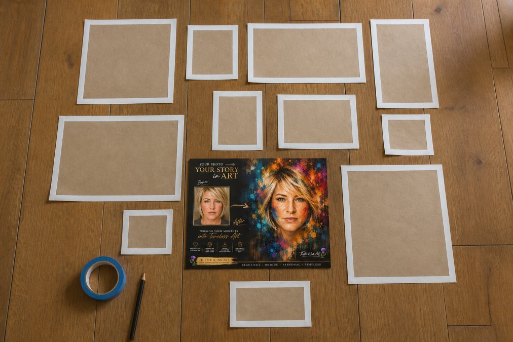
Paper Cutout Method
Cut pieces of newspaper or brown parcel paper to the exact dimensions of each frame you plan to hang. Arrange them on the floor first to experiment with composition, then fix them to the wall with painter's tape before committing to any holes. Label each cutout with the corresponding piece of art and mark the hanging point on each template. When you drive the nail through the paper, you're hitting the correct position every time.
Digital Layout Simulation Tools
Digital tools let you simulate a gallery wall layout with reasonable accuracy. Room planning apps allow you to input your wall dimensions and drag virtual frames into position, experimenting with different compositions without physical effort. Use digital tools for initial exploration, then validate your final layout with the paper cutout method before hanging.
Selecting Art, Frames, and a Cohesive Colour Palette
A cohesive colour palette is the most reliable way to unify diverse pieces. You don't need every print to share the same colours, but pulling two or three tones across the arrangement creates visual continuity.
Building Around an Anchor Piece
An anchor piece is the largest or most visually dominant work in your gallery wall arrangement. Choose your anchor piece first, then build outward. The personalised portrait options from Thistle and Ink Art work exceptionally well as anchor pieces. A large-format print of the Personalised Photo to Digital Art Portrait brings immediate character and a focal point to any arrangement, and because it's a digital download, you control the print size to suit your wall exactly.

Mixing Frame Styles for Visual Balance
Mixing frame styles adds depth and personality to a gallery wall, but it requires a guiding principle to avoid visual chaos. Vary the frame style while keeping the colour consistent, or mix frame colours while keeping the style consistent. What rarely works is mixing both style and colour without a unifying element elsewhere in the composition.
Gallery Wall Spacing Tips for a Polished Arrangement
Spacing is where most DIY gallery walls fall apart. As a general rule, space frames between 5 and 8 centimetres apart for a tight, gallery-style look. Larger gaps, up to 15 centimetres, create a more relaxed, editorial feel. What matters most is consistency: irregular spacing draws the eye to the gaps rather than the art.
For grid layouts, precision is everything. Use a spirit level and a tape measure at every step.
| Arrangement Style | Recommended Gap | Visual Effect | Best For |
|---|---|---|---|
| Tight gallery grid | 5-7 cm | Formal, museum-like | Matching frames, uniform sizes |
| Relaxed editorial | 10-15 cm | Airy, curated | Mixed sizes, varied styles |
| Salon style | Irregular | Dynamic, eclectic | Large collections, stairwalls |
| Symmetrical pair | Equal on all sides | Balanced, classic | Two or four matching pieces |
Eye-Level Ergonomics and Accessibility
The centre of your gallery wall arrangement should sit at approximately 145-150 centimetres from the floor. This corresponds to average eye level for a standing adult and is the standard used by professional galleries and museums. For arrangements above furniture, measure 20-25 centimetres above the top of the sofa, bed, or console table to maintain visual connection.
If your household includes people of different heights, or if the space will be used by wheelchair users, consider centering the arrangement slightly lower, around 135-140 centimetres, to make the display accessible for everyone.
Best Tools for Hanging Gallery Walls Without the Guesswork
A spirit level is non-negotiable: even experienced decorators cannot hang a straight row of frames by eye. A tape measure, pencil, and a pack of picture hooks in mixed sizes cover most hanging scenarios. For heavier frames, wall anchors appropriate to your wall type are essential.
Rental-Friendly Hanging Methods
Renters face genuine constraints, but several reliable alternatives exist. Adhesive picture-hanging strips hold frames securely on smooth, painted surfaces without drilling. They're rated by weight, so check the packaging against your frame weight before use. Command-style adhesive hooks work similarly and are suitable for lighter frames. For heavier pieces, over-door hanging systems and freestanding picture ledges offer completely hole-free display options.
As noted in Shelter's guide to tenant rights and home alterations, tenants should always check their specific tenancy agreement before making any alterations, as terms vary significantly between landlords and letting agents.
Step-by-Step Gallery Wall Layout Hanging Guide
A gallery wall layout comes together in a specific sequence.
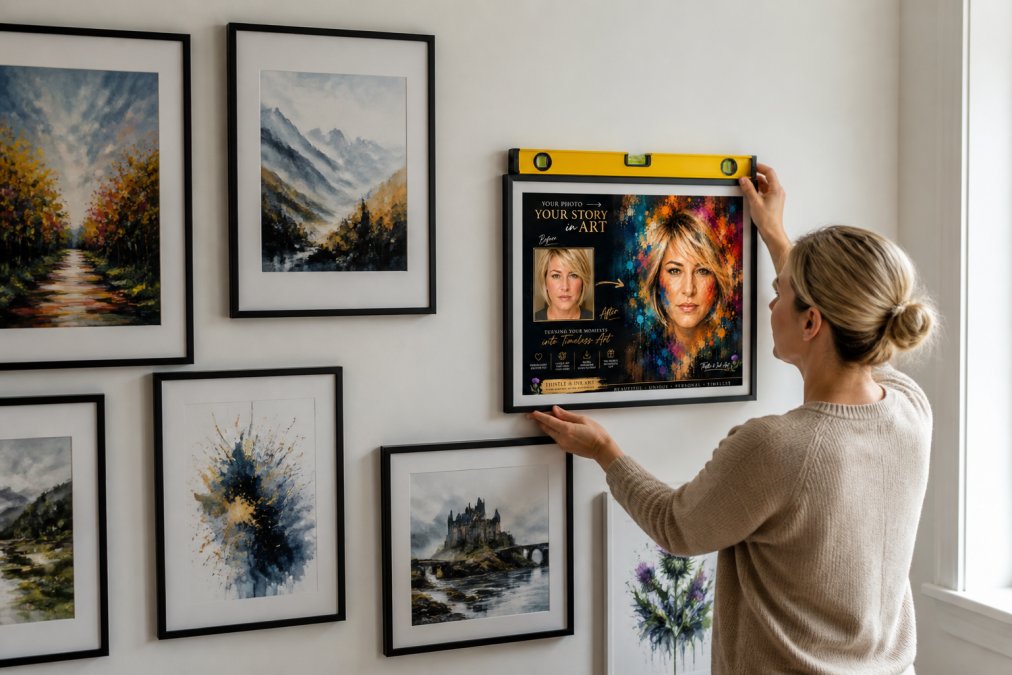
-
Measure and mark your wall space. Use a tape measure to identify the outer boundaries of your arrangement. Mark lightly with a pencil.
-
Arrange frames on the floor. Lay out all frames in the composition you've planned. This is your final check before anything goes on the wall.
-
Create paper templates. Cut paper to the size of each frame and mark the hanging point on each template.
-
Fix templates to the wall with painter's tape. Step back and assess the arrangement from the distance you'll normally view it from. Adjust spacing as needed.
-
Mark your nail or hook positions. Using the hanging-point marks on each template, make a light pencil dot on the wall through the paper.
-
Remove templates and fix hardware. Drive nails or hooks at each marked position. Use a spirit level to check alignment as you go.
-
Hang frames and check levels. Hang each frame, then use your spirit level to confirm it's straight. Small adhesive bumpers on the bottom corners of each frame prevent frames from tilting over time.
-
Step back and assess the full arrangement. Minor adjustments are normal at this stage.
Setup typically takes two to three hours for an arrangement of six to eight pieces, including planning time (the American Academy of Dermatology).
Common Gallery Wall Mistakes to Avoid
Skipping the planning stage. Going straight to hanging without a floor layout or paper templates causes asymmetric spacing, frames that don't relate to each other, and arrangements that sit too high or too low.
Using too many focal points. A gallery wall arrangement needs one dominant anchor piece. When several large prints compete for attention, the composition feels restless rather than curated.
Ignoring the colour palette. A collection of prints that share no colour logic looks disjointed. Even a subtle shared tone creates cohesion.
Hanging everything at the same height. For salon-style and asymmetric arrangements, varying the height of individual frames creates movement and visual interest.
Buying art to fit gaps rather than the composition. When you know your layout in advance, you can source art intentionally. [The Colour Unleashed - Personalised Colour Portrait](https://www.thistle-and-ink-art.co.uk/products/colour-unleashed-personalised-colour-portrait) from Thistle and Ink Art is available as an instant digital download, which means you can print it at the exact size your layout requires.
Over-spending on frames before testing the layout. Commit to your arrangement with inexpensive frames first. Once you're satisfied with the composition, upgrade the frames that matter most.
Planning a gallery wall layout takes more preparation than most guides suggest, but the result is worth the effort. If you're starting with the art itself, Thistle and Ink Art offers instant digital downloads, including personalised portraits and bold abstract prints, that you can size, print, and frame to suit your exact layout. Browse the Unapologetically You - Personalised Abstract Portrait and the full collection to find pieces that make your wall tell a story.

Frequently Asked Questions
What is the standard spacing between frames on a gallery wall?
The most widely recommended spacing between frames is 5 to 8 centimetres. Keeping gaps consistent across the arrangement creates a cohesive, intentional look. For a tighter, more editorial feel, reduce spacing to around 3 centimetres. For a relaxed salon-style display with larger frames, you can push gaps to 10 centimetres. The key is to decide on a spacing before you hang anything and stick to it throughout the entire composition.
How do you plan a gallery wall layout without damaging walls?
Trace each frame onto paper, cut out the shapes, and arrange them on the wall using painter's tape. This lets you test the full composition before making a single hole. For renters or those wanting a damage-free finish, adhesive picture-hanging strips rated to the frame's weight are a practical alternative to nails. Always check the strip's weight rating against each frame before mounting. This approach works well with lightweight frames and digital art prints printed at home.
Should a gallery wall be symmetrical or asymmetrical?
Both work, and the choice depends on the room's existing style. A symmetrical grid layout suits formal or minimalist interiors, where matching frames in neat rows create a calm, ordered focal point. An asymmetrical salon-style arrangement feels warmer and more personal, mixing frame sizes and orientations for a curated, lived-in look. Most gallery walls lean asymmetrical because it accommodates different print sizes more naturally and is more forgiving when adding pieces over time.
What is the 2/3 rule for wall art?
The 2/3 rule suggests that a piece of wall art or a gallery wall arrangement should occupy roughly two-thirds of the wall width it sits on, or two-thirds of the width of the furniture below it. For example, if a sofa is 180 centimetres wide, the gallery wall above it should span approximately 120 centimetres. This proportion prevents the arrangement from looking too small and floating, or too large and overwhelming the space.
How do I get affordable art prints for a gallery wall?
Digital art downloads are the most budget-friendly option. You pay once, download the high-resolution file, and print it at home or through a local print shop in any size you need. Thistle and Ink Art offers personalised digital art prints from £8.99, including abstract portraits and custom photo-to-art conversions. Printing at home on quality paper and using frames from budget homeware retailers keeps total costs low without sacrificing the finished look.
What are the most common gallery wall mistakes to avoid?
The most frequent errors are hanging frames too high, using inconsistent spacing, and starting without a plan. Frames hung above eye level make a room feel disconnected. Random gaps between frames break the visual flow of the arrangement. Skipping the planning stage, whether with paper templates or a digital tool, almost always results in unnecessary holes and a composition that looks unbalanced. Choosing art that shares no common thread in colour, style, or subject also makes a display feel cluttered rather than curated.
This article was written using GrandRanker