

Table of Contents
- The 2/3 to 3/4 Rule: The Foundation of Wall Art Sizing
- How to Measure Your Wall Space and Furniture
- Standard Picture Frame Sizes UK and Aspect Ratios
- How to Arrange Wall Art Above a Sofa
- DIY Gallery Wall Layout Guide for Any Room
- Choosing Wall Art Size for Different Rooms and Ceiling Heights
- Weight, Hardware, and Lighting Considerations
- Frequently Asked Questions
Last Updated: September 12, 2026
The 2/3 to 3/4 Rule: The Foundation of Wall Art Sizing
The single most useful rule for how to choose wall art size: your artwork should span roughly two-thirds to three-quarters of the width of the furniture below it. Get that proportion right and almost any piece will look intentional.
A sofa that's 200cm wide wants art between 133cm and 150cm across, the sweet spot where the piece reads as connected to the furniture instead of floating above it (the NHS). The rule mirrors a principle interior designers lean on constantly: scale and proportion. Art that's too small makes a wall feel bare; too large crowds the room and overwhelms everything else.
This guide walks through the full sizing process, from measuring your wall to hanging height, gallery layouts, and the hardware questions most guides skip.
How to Measure Your Wall Space and Furniture
Start with the furniture, not the wall. The width of your sofa, sideboard, or bed headboard decides your art size, and a tape measure plus two minutes gets you there.
Measure the full width of the furniture piece. Then calculate your target range by multiplying that width by 0.66 and by 0.75. For a 160cm console table, that's roughly 106cm to 120cm of total art width. If you're hanging a single piece, that's your frame width. If you're hanging a pair, divide by two and allow for the gap between them.
Wall width matters too, but as a secondary check. Art should occupy 50% to 75% of the available wall width above a piece of furniture, leaving negative space at either side. On a very wide wall, you may need a gallery wall rather than one large canvas.
- Measure furniture width in centimetres
- Multiply by 0.66 for the minimum art width
- Multiply by 0.75 for the maximum art width
- Check the total leaves at least 15cm of wall visible on each side
- Note the ceiling height for later reference
Standard Picture Frame Sizes UK and Aspect Ratios
Standard picture frame sizes UK buyers find most often are A4, A3, A2, A1, and the common 30x40cm, 40x50cm, and 50x70cm formats. Knowing these before you commission or download artwork saves a fortune in custom framing.
Here's how the common sizes map out:
| Size | Dimensions (cm) | Typical Use |
|---|---|---|
| A4 | 21 x 29.7 | Small gallery clusters, shelves |
| A3 | 29.7 x 42 | Paired prints, narrow walls |
| A2 | 42 x 59.4 | Single statement above a desk |
| 30 x 40 | 30 x 40 | Bedside, hallway groupings |
| 40 x 50 | 40 x 50 | Above a chair or small console |
| 50 x 70 | 50 x 70 | Above a sofa, medium walls |
| A1 | 59.4 x 84.1 | Large single statement pieces |
Aspect ratio matters as much as size. Horizontal suits a wide sofa or low sideboard; vertical works above a tall chest of drawers or in a narrow alcove. Portrait formats draw the eye upward and make low ceilings feel taller; landscape formats widen a narrow room.
For digital downloads, check the resolution before printing. A file needs roughly 300 dots per inch at your intended print size. A 50 x 70cm print needs around 5900 x 8300 pixels; anything smaller looks soft when enlarged.
How to Arrange Wall Art Above a Sofa
Center the art on the sofa, not the wall. This fixes 90% of awkward living rooms, whether you're hanging one piece or five.
The centre of your arrangement should align with the centre of the sofa. If the sofa sits off-centre, the art follows the sofa, not the architecture. Aim for the centre of the artwork at roughly 145cm from the floor, standard eye level for most adults. Above a sofa, the bottom edge of the frame should sit 15cm to 25cm above the back of the sofa: close enough to feel connected, far enough to avoid heads knocking it.
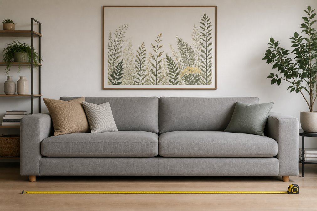
For a single piece, use the 2/3 to 3/4 rule. For a pair, treat them as one unit and split the target width in two. For three or more, the total span still follows the rule, but each individual frame gets smaller.
DIY Gallery Wall Layout Guide for Any Room
A DIY gallery wall layout guide starts with one decision: symmetrical or organic. Symmetrical grids suit formal spaces and calm colour palettes; organic arrangements, where frames of different sizes cluster around a central anchor piece, suit eclectic rooms. But what actually determines whether the wall works is the layout template you commit to before you drill.
Here are five layouts that cover most rooms, with the maths for each:
- The single row. Three to five frames of equal height, hung in a straight horizontal line. Best above a sofa or sideboard. Total span follows the 2/3 to 3/4 rule; keep gaps at 5cm to 8cm.
- The grid. A 2x2 or 3x2 block of matching frames. Best for a formal dining room or hallway. Treat the whole block as one unit and apply the 2/3 to 3/4 rule to the block, not each frame.
- The anchor plus satellites. One large piece (A2 or 50x70cm) with two to four smaller frames arranged around it. Best for eclectic living rooms. The anchor sits at eye level; satellites sit 5cm to 8cm away.
- The vertical stack. Three or four frames of the same width, stacked in a column. Best for narrow walls, alcoves and hallways. Total height should not exceed two-thirds of the wall height.
- The salon style. A dense, edge-to-edge cluster of mixed sizes. Best for period properties and maximalist rooms. Keep gaps consistent at 5cm and align the outer edges into a rough rectangle.
Lay it out on the floor first. Cut paper templates to the exact size of each frame, tape them to the wall with low-tack tape, and live with the arrangement for a day before drilling, the step most people skip and then regret.
For the maths, work backwards from the wall. Measure the available width, subtract 15cm of breathing space on each side, and that is your maximum cluster width. Divide by the number of frames plus the gaps to find your maximum frame width. For example, a 240cm wall with 15cm margins leaves 210cm. Three frames with two 6cm gaps leaves 198cm for frames, so each frame can be up to 66cm wide.
Keep spacing consistent: 5cm to 8cm between frames reads as deliberate; anything wider looks accidental. Treat the whole cluster as one visual block and apply the 2/3 to 3/4 rule to the block, not to each frame inside it.
To skip the paper stage, free tools let you mock up a gallery wall on a photo of your room. Most phone AR apps from picture-frame retailers let you point the camera at the wall and drop in a frame at true scale, catching proportion problems before you buy. The trade-off: AR apps only show frames the retailer sells, so use them as a sanity check rather than a design tool.
Choosing Wall Art Size for Different Rooms and Ceiling Heights
Ceiling height changes everything, and almost no sizing guide mentions it. With standard 2.4m ceilings, the 145cm eye-level rule works cleanly. With 3m ceilings, hanging art at 145cm leaves a dead zone of empty wall above and makes the room feel unfinished.
For tall rooms, raise the centre point of your art to roughly 150cm to 160cm, and consider larger pieces or a vertical stack rather than one mid-sized frame. For low ceilings, keep art lower and favour horizontal formats, which stop the eye from travelling upward and creating a cramped feeling.
Room type shapes the choice too:
- Living rooms: large single pieces or wide gallery clusters above the sofa
- Bedrooms: smaller, calmer pieces centred above the bed headboard
- Hallways: narrow vertical pieces or a stacked column to suit the proportions
- Dining rooms: wide horizontal pieces above a sideboard, scaled to its width
- Home offices: pieces positioned at seated eye level, not standing eye level
Scale and proportion should always win over personal preference for size. You can love a small print and still hang it in the wrong room.
Weight, Hardware, and Lighting Considerations
Weight and hardware decide whether your carefully planned arrangement stays on the wall. A framed A1 print behind glass can weigh several kilograms, and standard picture hooks rated for light loads won't hold it safely, the practical layer most sizing guides skip, and the one that causes the most damage when it's wrong (hse.gov.uk).
Start by estimating the weight. A framed print weighs roughly 1kg per 30cm of width for a slim frame, and closer to 1.5kg per 30cm for a wide or glazed frame. A 50x70cm glazed print is often 2.5kg to 3kg; an A1 behind glass can reach 4kg to 5kg. Weigh your actual frame if you can, bathroom scales under the corner give a close enough figure.
Match the fixing to the wall and the weight:
- Plasterboard walls. Use hollow-wall anchors or locate timber battens with a stud finder. A single anchor in plasterboard alone is not safe for anything over about 2kg (hse.gov.uk).
- Solid brick or stone walls. Use masonry plugs and screws. Drill slightly deeper than the plug and clear the dust before inserting.
- Lath and plaster walls (common in older properties). Treat as fragile; use a batten fixed across two studs and hang from that.
- Rented homes where drilling is not allowed. Adhesive strips rated for the frame's weight work for lighter pieces, and leaning art on a shelf or picture ledge avoids fixings entirely.
For anything heavier than a few kilograms, use two fixings rather than one so the frame can't pivot. Frames wider than 60cm should always have two hanging points, the cheapest insurance you can buy for a large frame: it stops the piece tilting and spreads the load across the wall.
Lighting changes how art reads, and the size that works. Direct sunlight fades prints and creates harsh glare on glass, so avoid south-facing walls for anything precious. Angled picture lights above a frame reduce glare and add warmth. In darker rooms, one well-placed light turns a mid-sized print into a focal point, so you can often go smaller than planned. In a very bright room, a large pale print can wash out entirely; a darker, more saturated piece holds its own better.
Ceiling height interacts with lighting and hardware too. With 3m ceilings, a picture light above a frame hung at 145cm leaves a dead zone of empty wall, and the light itself becomes the visual anchor. Raising the art to 150cm to 160cm and pairing it with a picture light at the top of the frame keeps the composition together. With low ceilings, keep art lower and favour horizontal formats, which stop the eye travelling upward and creating a cramped feeling.
Frequently Asked Questions
What is the perfect size for wall art?
There is no single perfect size, but the 2/3 to 3/4 rule is a reliable starting point. The art should cover two-thirds to three-quarters of the furniture width below it. For a 180cm sofa, aim for art that is 120cm to 135cm wide. Also consider the wall itself; art should occupy roughly 60-75% of the available wall space between furniture and ceiling for visual balance.
What is the 2/3 rule for wall art?
The 2/3 rule states that wall art should span about two-thirds the width of the furniture it hangs above. If your sofa is 150cm wide, the art should be approximately 100cm wide. This creates a proportional relationship that feels intentional and grounded. You can stretch to three-quarters for a bolder look, but going smaller makes the art look undersized and lost.
How high should wall art be hung from the floor?
The standard eye level for hanging art is 145cm to 152cm from the floor to the centre of the artwork. This is the typical sight line for someone standing in the room. In rooms where people mostly sit, such as a dining room, lower it slightly to around 140cm. Always prioritise the relationship between art and furniture over strict floor-to-centre measurements.
How do I know if art is too big for a wall?
Art is too big if it leaves less than 15cm to 20cm of negative space between the art's edges and adjacent walls, corners, or architectural features like windows and doors. It should also not extend beyond the width of the furniture below it. If the art dominates the wall and leaves no breathing room, it will feel cluttered and oversized.
What are the standard picture frame sizes UK?
Common standard picture frame sizes UK include A4 (21cm x 29.7cm), A3 (29.7cm x 42cm), A2 (42cm x 59.4cm), and A1 (59.4cm x 84.1cm). Other popular imperial sizes are 8x10 inches, 12x16 inches, and 16x20 inches. Knowing these dimensions helps you choose digital art that fits readily available frames, saving on custom framing costs.
How do I arrange wall art above a sofa?
Centre the art horizontally above the sofa. Leave 15cm to 25cm of space between the bottom of the frame and the top of the sofa back. For a single piece, follow the 2/3 rule. For a gallery wall, keep spacing between frames consistent at 5cm to 8cm. The overall arrangement should feel visually connected to the furniture, not floating independently on the wall.
What is the 70/30 rule in art?
The 70/30 rule is a guideline for visual balance in gallery walls or room composition. It suggests that roughly 70% of your art should share a common theme, colour palette, or style, while 30% can be contrasting or accent pieces. This creates cohesion without monotony. For example, three abstract prints in similar tones paired with one bold, contrasting piece.